Timeout warning — Designing for enough time
Balancing accessibility, progressive enhancement and a critical session warning.
Overview
While working on a government-facing service, our team needed to warn users before an inactive session expired. What appeared to be a small interface component quickly became a broader design decision involving accessibility, progressive enhancement, technical resilience and the realities of the systems people use to access public services.
My role was to explore the available approaches, compare their strengths and limitations, and help the team reach a decision that was inclusive, technically feasible and defensible in a future service assessment.
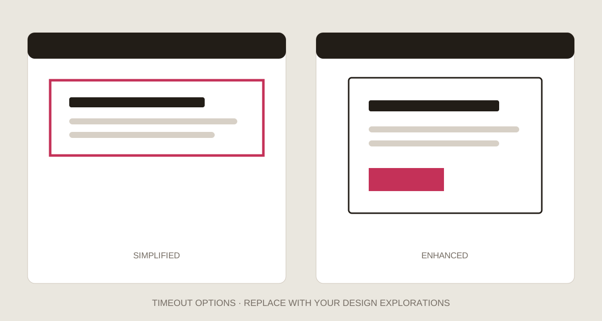
Simplified and enhanced approaches — replace with your original design explorations
Why timing matters
WCAG 2.1 Success Criterion 2.2.1: Timing Adjustable requires people to be able to turn off, adjust or extend most time limits, with exceptions including time limits longer than 20 hours. When extending a limit, users must receive at least 20 seconds to act.
For our service, compliance was only the starting point. An unexpected sign-out can be disorienting and may cause someone to lose confidence in continuing—particularly if they have spent time entering information.
The technical constraint
Government services follow a progressive-enhancement approach: begin with resilient HTML, layer on CSS, and use JavaScript where it adds necessary capability. This matters because we cannot assume which device, browser, connection or assistive technology someone will use.
A warning that appears before a session expires needs JavaScript to track inactivity and surface itself at the right moment. The design therefore needed both an enhanced experience and a sensible core experience if JavaScript was unavailable.
Solution hypothesis
We wanted to reach a design that was resilient and inclusive for all users. The decision would be successful if the possible approaches had been thoroughly investigated, the trade-offs were understood and the chosen route could be supported technically.
Option 1 — A simplified approach
The simplified route used familiar GOV.UK patterns and an error summary to explain that the session had already timed out. It told users they would need to sign in again if they wanted to continue.
Strength: It could be delivered using core HTML and CSS, so the message remained resilient without JavaScript.
Limitation: It only explained what had happened after the event. With no advance warning or opportunity to extend the session, it did not solve the central user need and risked being disorienting.
Option 2 — An enhanced approach
The enhanced route used a modal dialogue shortly before timeout. If the user acted, they could continue their session; if they did not, the service signed them out and showed a page explaining what had happened.
Strength: It warned people at the point of need and offered a clear opportunity to remain signed in.
Limitation: The interaction depended on JavaScript and introduced demanding accessibility behaviours, including focus management, announcing the dialogue and preventing the underlying page from appearing actionable.
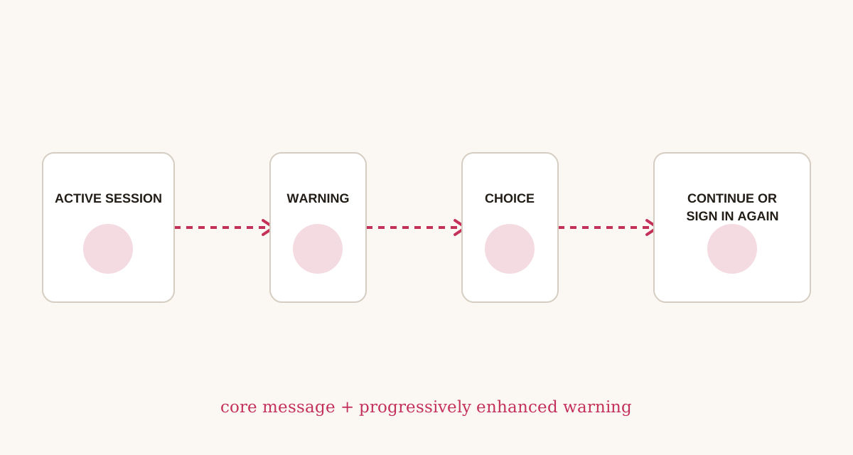 Core and enhanced timeout journeys — replace with your original flow or prototype
Researching existing patterns
We reviewed relevant GOV.UK patterns and found that GDS had been exploring an experimental modal dialogue, including its use as a session-timeout warning. We also spoke with a GDS adviser and colleagues elsewhere in the department to understand the direction of travel and challenge our assumptions.
The research highlighted that an accessible modal needed to:
- Meet WCAG AA requirements and avoid relying on colour alone.
- Announce that an alert dialogue had opened and constrain keyboard focus within it.
- Return focus appropriately when closed and provide a clear way to close it.
- Remain visible across scrolling, screen sizes and orientation changes.
- Provide controls large enough for touch and usable through keyboard or voice input.
- Maintain sufficient contrast, logical source order and valid markup.
The GOV.UK modal dialogue example was experimental, so it was evidence to consider rather than a component to adopt without service-specific research and testing.
Reaching a decision
The team was initially torn between the resilience of the simplified approach and the clarity of the enhanced warning. Our developers completed a technical spike to establish whether the enhanced behaviour was feasible.
The resulting direction combined both layers: retain a simple signed-out explanation as the core experience, then progressively enhance it with an advance warning where JavaScript was available. This provided a more intuitive experience without making the service’s basic recovery message dependent on scripting.
Placeholder: Add the final timings, button labels, content decisions and screenshots from the implemented warning.
What this work demonstrated
This decision was valuable because the design process made the trade-offs visible. Instead of choosing a modal because it felt familiar—or rejecting it because it required JavaScript—we considered accessibility behaviour, technical resilience, existing government evidence and the consequences for users together.
Placeholder: Add usability findings, accessibility review feedback, assessment outcomes or evidence from the live service.