Swift — A banking app with its own visual rhythm
Taking a mobile banking concept from first wireframes to a complete UI system.
Overview
Swift is a mobile banking app I designed for the final submission of my Professional Certificate in UI Design. The brief gave me the freedom to take a product from initial wireframes through multiple iterations to a set of polished final screens.
Alongside the interface itself, I created a design toolkit, colour palette and grid system from scratch. I completed the project in roughly three weeks while working full-time.
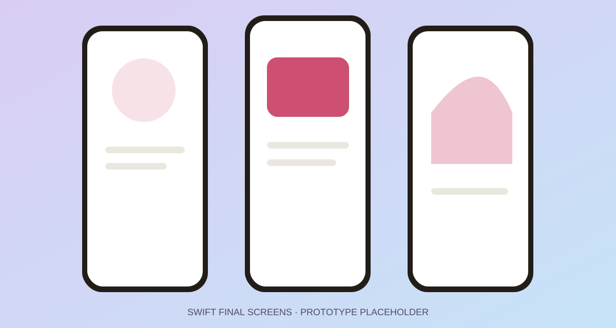
Final Swift screens — replace this placeholder with your finished mobile UI
The brief
The project was an opportunity to demonstrate an end-to-end UI design process: establish a clear structure, translate it into a distinctive visual direction and make sure the final screens behaved as one coherent product rather than a collection of separate compositions.
Because it was a course project, I could experiment without the restrictions of an existing brand or production system. That freedom made visual decision-making more important, not less—every colour, shape, spacing rule and component needed a reason to belong.
Project length: approximately three weeks
Context: Professional Certificate in UI Design
Role: independent UI designer
From wireframes to interface
I began with wireframes to establish hierarchy and flow before committing to a visual style. Working at lower fidelity made it easier to compare layouts, move content and identify where the banking experience needed clearer emphasis.
The designs then moved through repeated iterations. Each pass gave me a chance to test the relationship between information density and visual energy: banking screens need to communicate important numbers clearly, but they do not have to feel cold or generic.
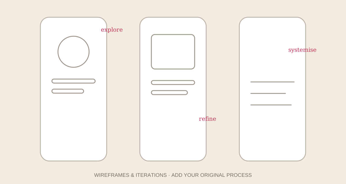 Wireframes and iterations — replace with your early sketches and screen progression
Building the toolkit
To keep the app consistent, I created a small design toolkit covering the foundations and reusable interface elements. This included:
- A colour palette for primary actions, surfaces, feedback and supporting accents.
- A grid and spacing system to create rhythm across different screen types.
- Typography rules for balances, labels, supporting information and actions.
- Reusable patterns for navigation, cards, controls and transactional content.
- Shape language that gave Swift its own recognisable personality.
Placeholder: Add typefaces, colour values, grid measurements or component examples from your original toolkit.
Visual exploration
Swift gave me room to experiment with colour and geometric forms while still respecting the clarity expected from a financial product. The final direction uses those expressive elements to create hierarchy and movement, while the underlying grid keeps the experience grounded.
The goal was not decoration for its own sake. Shapes and colour helped group information, signal actions and make repeated banking tasks feel less mechanical.
Final screens
The final submission brought the wireframes, visual language and toolkit together into a consistent mobile experience. The screens demonstrate how the system could stretch across key banking moments without losing its identity.
Placeholder: List the final flows shown in your prototype—for example onboarding, home, transactions, payments or account management.
Reflection
Completing Swift alongside full-time work required a focused process and disciplined iteration. It remains a project I enjoyed because it allowed me to be creatively ambitious while proving that the visual choices could still operate as a system.
Placeholder: Add tutor feedback, assessment results or the single design decision you would revisit today.